2020 marked the end of a decade – ten wonderful, bizarre, tumultuous years that will go on to shape the future. Today, we exist more in the virtual world than we ever had. News, views, and reviews are the criteria of success. Good, bad, true, or fake, people zip through several opinions, ideologies on social media channels alone that marketers today have to adapt to this relentless reality.
So, when brands decide to revamp their image through a rebranding exercise to be relevant and relatable, we understand. From the perspective of non-designers, rebranding would be just about a new logo or changing around the colour scheme; whereas for the designers, it is a strategic, insightful process that has the potential to change the brand persona and eventually the overall public opinion.
Personally, rebranding is a sign of hope and growth. It marks an evolution of the company in the right direction. It happens when a company grows out of its box and is ready to embark on a journey that allows it to relate with the new generations and satisfy the older fans who grew up with it. When done right, a rebrand can inspire new audiences, create positive conversations and increase sales. However, when a rebrand misses the mark it can do more harm than good.

Over the past decade, we all have seen a lot of rebrands. Sometimes it’s in the form of a small refresh like tweaking the logo. Other times it was a major overhaul where a company’s entire identity is redefined. In this article, we will talk about some of the successful rebrandings and what you can learn from them.
Burger King
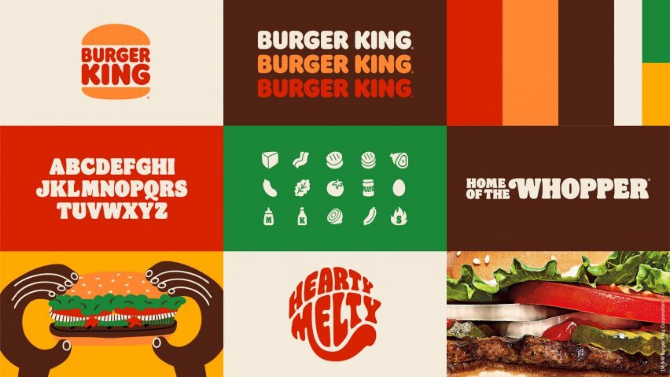
In 20 years, Burger King has gone through its first rebrand. It is not done on a mere whim, Burger King has recently dialed up on quality and taste. Along with that, they have cut down on artificial preservatives and taken a pledge to be more environmentally sustainable.
The new visual identity captures the quintessential values of Burger King: big, bold, mouthwatering, playfully irreverent, and proudly true.
For the logo, they have taken a modern, minimalist approach but still pays homage to the brand heritage by sticking to the trademark vintage icon. For colour and typography, they have gone unapologetically rich and playfully bold.
This is reflected throughout their restaurants, packaging, menu design, crew uniform, decor, and the entire digital media channels.
Uber
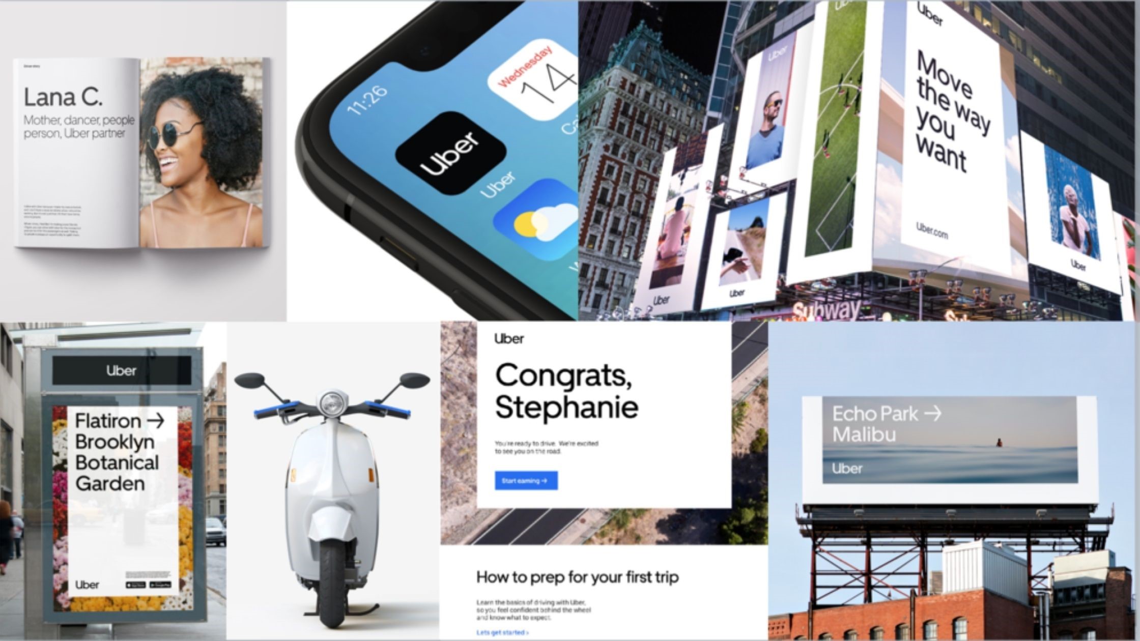
Uber is a global and a local brand but in 2017 Uber found itself apologizing after several scandals that affected both its customers and employees. They changed leadership and brought in the new CEO, Dara Khosrowshahi, and tried to change their image of the macho, boy band, tech startup to a global mobility platform.
Apart from the internal culture, Uber wanted to create a brand experience and their redesign included logo, custom typeface, photography, illustration, the layout of advertising, and promotional materials.
This clean, simple yet global approach, helped Uber break away from their former CEO and toxic culture, pushing the company forward into a new era with a promise to be better and responsible.
Air Arabia
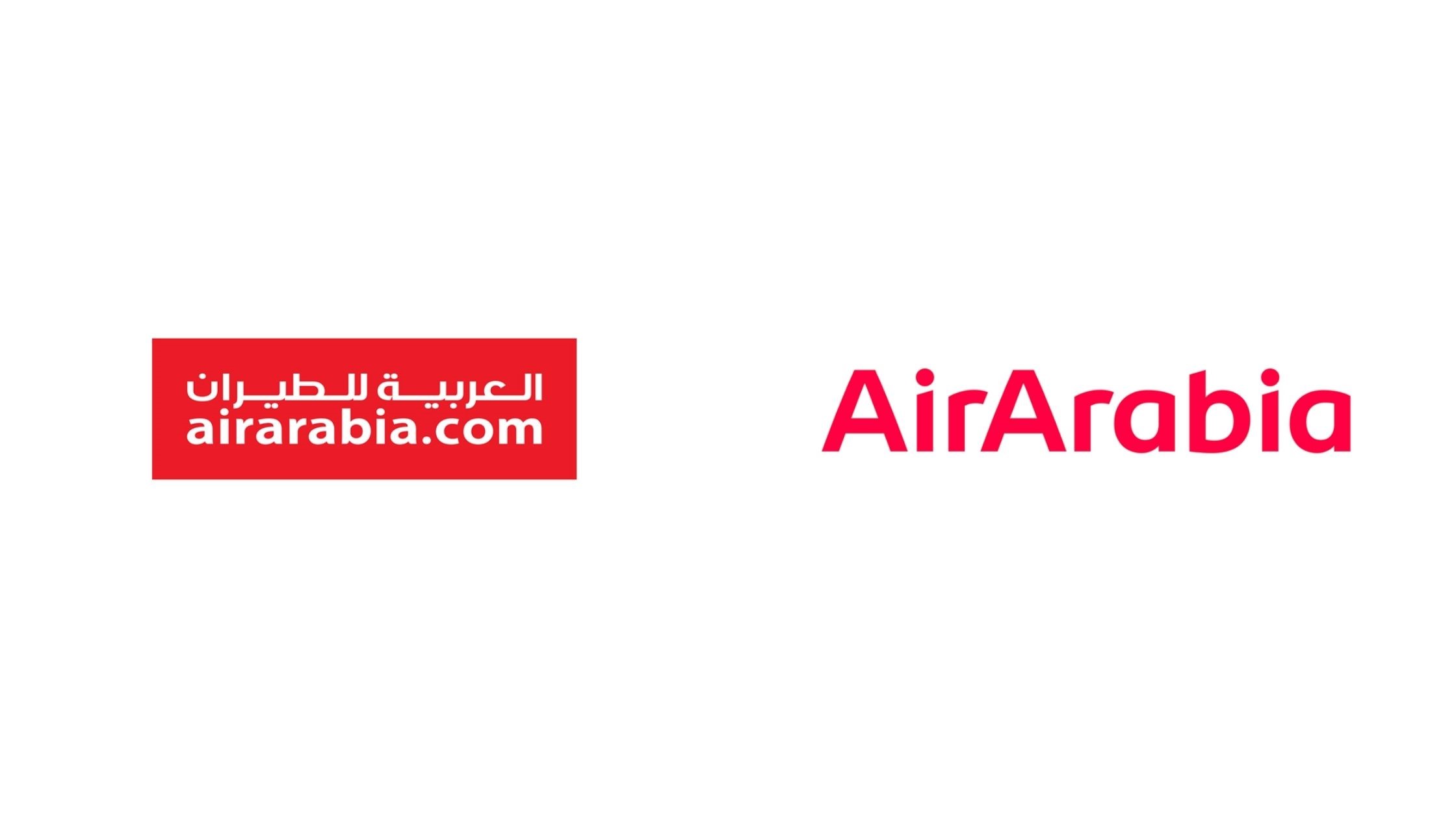
Air Arabia is the Middle East and North Africa’s first and largest low-cost carrier airline, launched in 2003. From serving just five routes with two aircraft in earlier days, the airline has currently grown and covers over 155 routes from multiple hubs spread across the UAE, Morocco, and Egypt. After working for 15 years, in 2018, Air Arabia unveiled their new corporate brand identity.
Based on the concept of ‘Modern Nomad’, the new brand identity aspires to connect with young, adventurous travellers who are eager to explore new places. For the new logo, the airline has chosen a modern yet elegant look. In regards to the colour, they moved away from the traditional red and have gone with an elegant shade of pink.
This rebranding effort highlights Air Arabia’s ambition, aspiration to please the younger audience.
Burberry
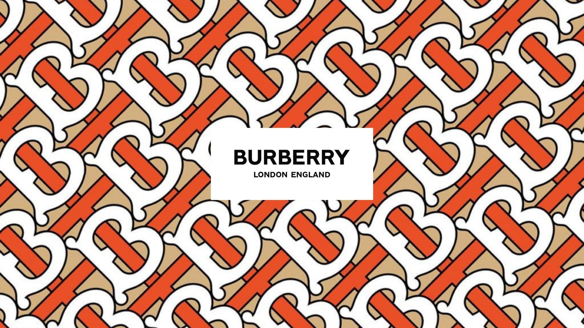
Burberry is a luxury brand, founded in England more than 150 years ago. Famous for popularizing trench coats and waterproof gabardines, at one point in time it was associated with being gang wear.
To break away from the rumour, Burberry took an active initiative of reinventing itself. Along with their iconic trenches, they glammed up their product design and introduced utility clothing with a sexy spin. To improve public opinion, they approached high-profile celebrities like positive images like Emma Watson, and Kate Moss.
After the rebrand, Burberry’s sales rose by 27%. A successful rebrand is sensitive to the history of the brand and never compromises with the heritage and integrity of the brand.
Youtube
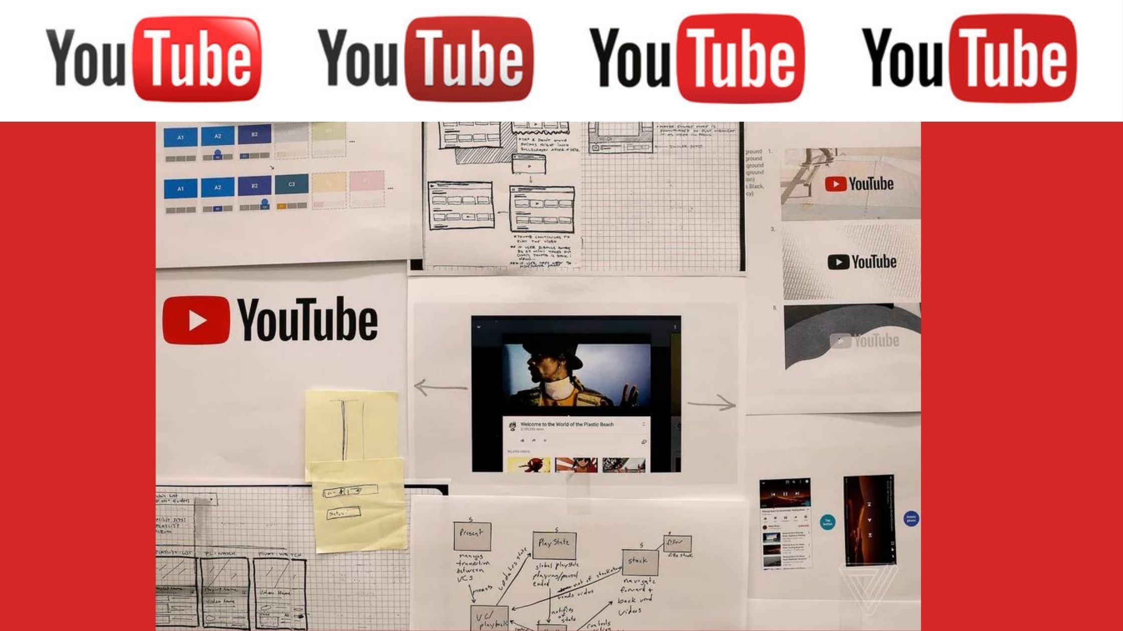
Youtube was founded in 2005 and 2017, for the first time in 12 years, Youtube decided to rebrand. The reason being over the last few years, Youtube has launched an array of services like YouTube Kids, Gaming, Red, TV, and Music. The team wanted a singular brand identity that shifts the focus from Youtube being a website to an expanded family of apps that stretch across multiple platforms.
The redesign included the logo, typeface, colour scheme, and a bunch of major changes that are aesthetically pleasing and functional on every screen. For the logo, they experimented with several fonts ranging from modern to VHS, classic television, and print era. Even, the iconic shade of red is unique to Youtube, the team settled on #FF0000, a really pure red that goes to the RGB of video.
House Of Parliament, UK
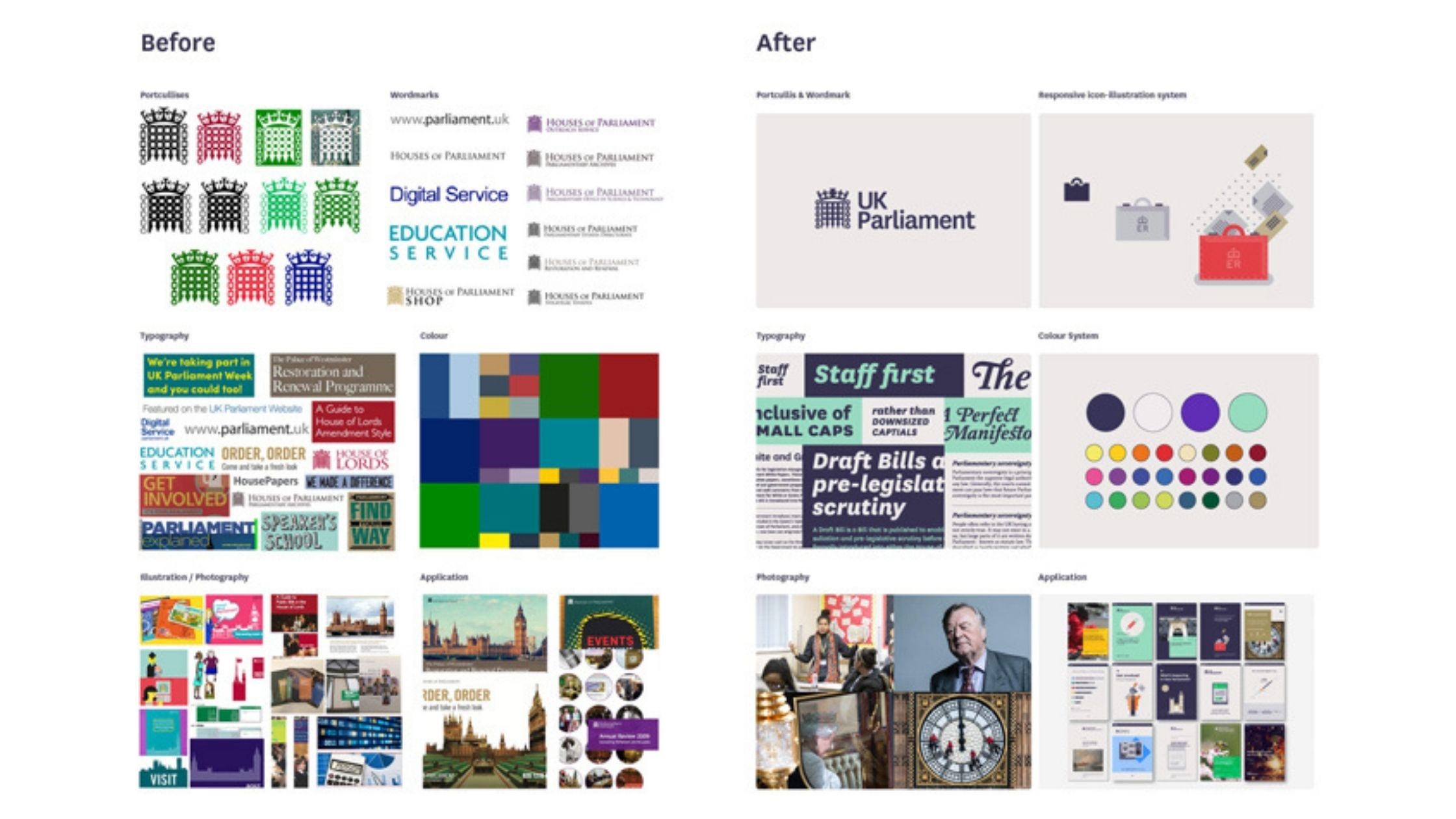
The House of Parliament or the UK Parliament is the institution responsible for making new laws, examining and scrutinizing the existing ones, holding debates, form budgets, and levy taxes. They underwent a rebrand in 2016 to make it more suited to the digital platforms.
Although, the Parliament was criticized for using the public’s money for this project the pros outweigh the cons. Keeping the prime focus on being ‘simple and clear’, the new logo is a redefined version of the traditional, medieval-style gate symbol.
Instead of a kaleidoscope of colours, the team curated a core palette of dark purple, mint green, and white, For the typeface, they went with serif typeface Register, designed by foundry A2-Type, to be used across communications.
For the graphics, the focus was to keep the design minimal and use flat icons. The idea was to impart the information distinctively without being overwhelmed by the design.
Despite the outrage, the rebranding was a success. According to the GDS, 98% of driving tests are now booked online and 12 million people have used the website to register to vote.
Dunkin’
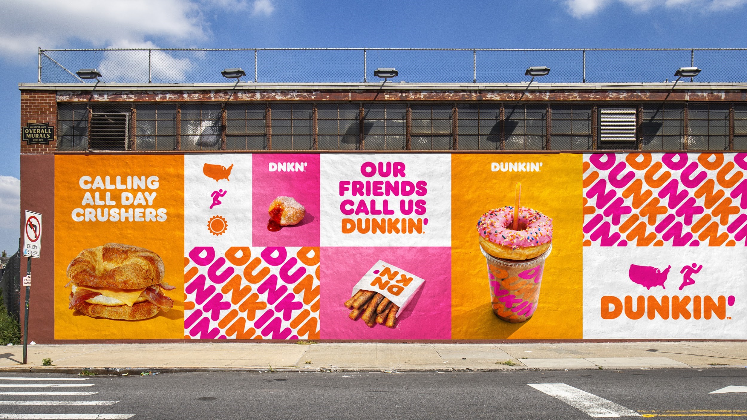
Dunkin’ has been selling donuts since 1950. While the brand is popular for its selection of donuts, the actual word ‘donut’ no longer resonates with their brand identity. With this rebranding exercise, Dunkin’ removed donut from its name and modernized the experience for customers while staying true to its heritage.
The rumoured reason behind this change is the fact that Dunkin’ wishes to move away from its identity as a glorified coffee – donut stop and expand its food and beverage menu.
This new redesign can be witnessed from inside the store to across the advertising and marketing channels. This rebrand included a logo redesign, packaging, store remodels, and brand messaging.
By this point, it is no secret that rebranding is expensive, time-taking and a high-risk affair that couldn’t be done on a whim. You have to be insightful about the market and your position in the industry to know when it is time to rebrand. However, if you have decided to rebrand, connect with a < font color=”red”>branding agency like Vowels, who with their team of expert strategists and designers, will give your company a brand new identity.
Some of our other services are logo design, a website development, tailored messaging, or a complete brand makeover. We specialize in brand consultancy, strategy, brand guidelines, CI manual, brand presentation, and corporate branding.
Also read – How Your Brand Receives More By Giving
Contact Us
Check out our work at < font color=”red”>Vowels
We are always available at hello@vowels.ae